Hand-embellished Prints
I am very excited about a new project underway—and while I can't reveal many details (yet), I can start to share the process of creating something brand new. The challenge is to come up with a solution to use a large amount of my work in a cost-effective way. Original artwork is beyond the scope of the budget, yet we want to create something more unique and special than limited edition prints of the same piece.
Enter hand-embellished prints. They sit between original artwork and a straightforward reproduction, such as giclées (fine art digital prints). Using a reproduction print as the base, the work is then added-to or worked-into with techniques such as touches or washes of paint, spots of clear acrylic to create highlights or other mark-making on top of the print.
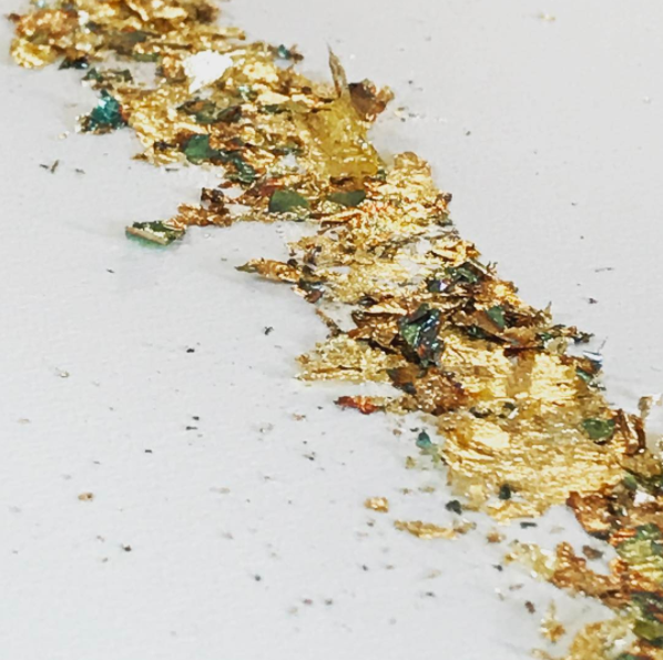
In the case of my burnt paper series, I have been testing ways to efficiently burn back into the paper print of an original, as well as create satisfying gilding effects that are cost-effective. Bristol Design Forge has been helping figure out how to use laser cutting to create a range of effects, from clean cuts that barely appear to be touched by heat, to heavier edges with a crispy effect (the latter being much to the owner's dismay, I think, as they pride themselves on getting as clean a cut as possible!).
Testing the possible range of laser cut effects for my burnt paper series, "Playing With Fire" at Bristol Design Forge, Bristol, UK. Kelly M. O'Brien ©2017
The samples are off to the client next week, and with a little luck, I'll be sharing more on this project in the near future.
Two New Commissions Going to Hong Kong
Two new pieces are winging their way this week to take up residence in a Mt. Nicholson Show Flat in Hong Kong.
These pieces are inspired directly from my very first and third works in this series, back in 2013. There was something very simple and innocent about Playing With Fire No. 1 and No. 3 that I enjoyed returning to in these two latest versions.
These new pieces are another example of scaling up and referencing earlier work. Clients often come to me with images of my former pieces, asking me if I can do something "similar to this one, only in these dimensions."
At first, I resisted the idea of just re-producing work to spec―is that really fine art? What I've learned is that they're all original! With flame and paper as the mediums, there is no way any two pieces will ever be identical.
As with any work in a series, there are subtle differences to be explored―the drip and flow of Chinese ink, a variation on gold leaf, what fire does to paper. So no matter the original model, this work truly has a mind of its own.
A big thank you to the team at James Robertson Art Consultants for the opportunity! And to Zed Al-Gafoor at Imagecentre in Bath for the beautiful images.
Playing With Fire Now Showing at Galerie Uhn
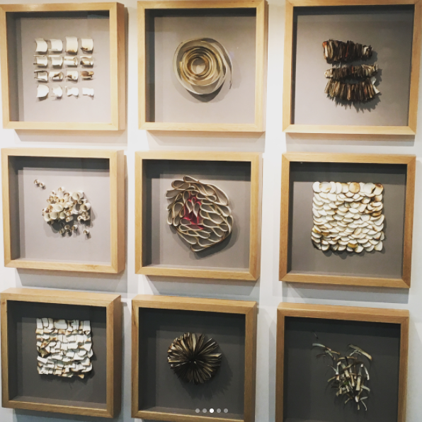
My exhibition at Galerie Uhn in Königstein, near Frankfurt, Germany opened with an enthusiastic gathering, highlighted by a classical music trio, reunions with dear friends, and a great response to my new work.

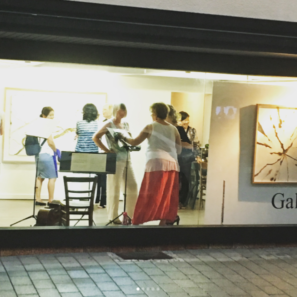
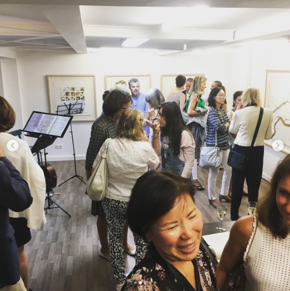
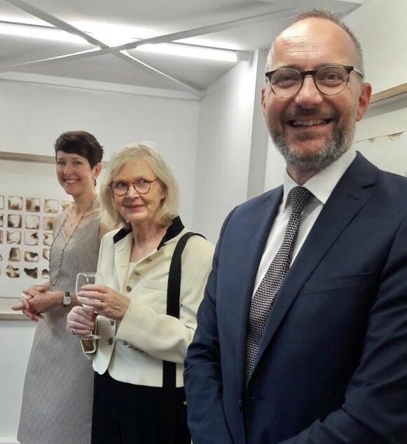
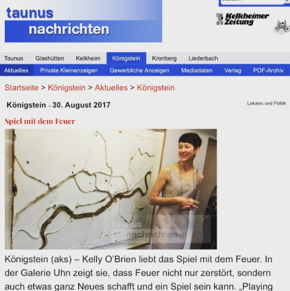
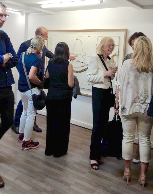

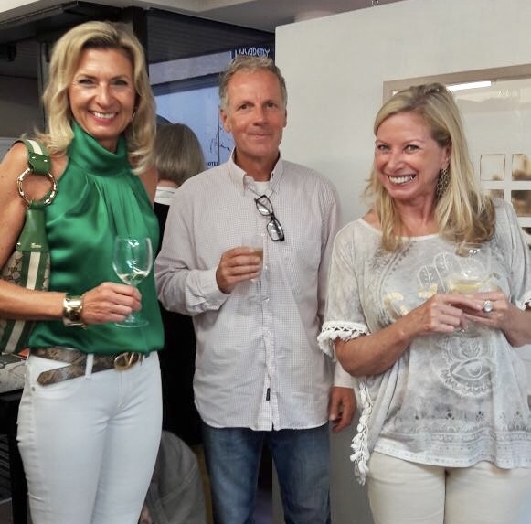
I also gave an artist talk on September 2nd, when I had an opportunity to discuss this work in public for the first time, using a Q&A format led by gallery owner Jimin Leyrer.
A very big thank you to Jimin and her family for lots of generous support and hard work to make this a great show, and to Ann-Katrin Sura for hosting a delightful gathering after the Vernissage.
There's also a brief article about the exhibition here (open the link with Chrome and it can translate for you).
The exhibition runs until 28 September.
New Commission: Scaling Up
A recently completed commission afforded me the opportunity to play with scale, materials and process. The client, a fine art consulting firm, wanted a larger version of a piece they had already placed in another project. I'd not "replicated" my burned paper pieces yet, thinking there was little I could do to control the effects of fire on paper and therefore produce a similar result. Let the challenge begin!
Earlier this year, I developed a technique to help me accurately translate my sketches to scale. It involves using oversized prints of my sketches, which I then slice into pieces and use as templates for re-drawing the layers at the correct size. It worked well for a Connecticut coastline-inspired piece, so why not use the same process using my own work as the original drawing?
The approach worked nicely and helped to expedite an otherwise traditional, yet time-consuming way to scale-up using a grid system to transfer an image. But what I'm particularly pleased about is that, despite an accurate rendering of the original design, the new version is entirely unique and different from the first. There is happily still not much you can do to control the outcome when taking blowtorch to paper, or when working with materials that are 300% larger than the first time around.
There are several challenges when working at a larger size, in this case 72 x 48 inches. First is workspace. My workbench isn't large enough, so I had to improvise by using the floor and a temporary workshop set up in our dining room (not ideal). The other issue is my Burning Shed, an unfinished outbuilding where I do the things that can't otherwise be done indoors (burning, spray paint, etc.). The Burning Shed was maxed out at this size, so for larger projects, I'll have to find another solution.
Materials take on a mind of their own at this size, especially paper. As much as I flattened the rolled watercolor paper, once you hit it with the blowtorch, it curls and warps as the fibers respond to the heat. I'll continue to explore solutions to this effect, or just work with it - which is what materials are teaching me anyway.
Speaking of learning, this is the first project where I used variegated gold leaf for the gilding. Variegated leaf is a metal leaf that has been heat-treated, chemically-treated or both to develop patinas and unique discoloration. In this case, I love how the subtle coppers, blues, reds and greens add interest to veins of gold that would otherwise be too monochrome and flat for a design of this size.
Overall, I'm pleased with the outcome on this project, with clear ideas on how to continue refining the work, especially at larger sizes - which I hope to do more of!
Material Lessons
This week I was reminded that when you fight with your materials, nobody wins. What's happening in the studio is often an object lesson for currents running deeper below. Some days you find yourself in the zone, things easily falling into place. Others - like this week - the more I fussed with trying to get something to work, the less cooperative the work became.
Over time, I've learned that if I'm not mindful, I use my work to stave off or avoid feeling things I'd rather not address - fear, pain, anxiety. After losing my father in March, I've kept an eye on this with varying degrees of success. Yet in the form of this particular piece, I found my self overworking, overdoing, protesting and insisting I could make it so if I only kept trying to save it.
After several days of this silliness, I talked with my mentor, Lisa Kokin, who gently and firmly instructed me to set the piece aside, put it away for at least a month, and revisit it with fresh eyes. Of course this is the wise thing to do - and even then, it may never be something I can fix. Maybe it will become something I'll have to let go.
Even the work that did end up being resolved this week felt like a struggle. A new piece in the Edgy series, this one has a darker, tighter feel to it, and didn't unfold as easily as the previous three pieces in this series of nine.
I do like it quite a bit. There's something about it that allows a range of elements to co-exist, if not comfortably, then tolerantly: light, dark, irregular, interesting, unruly, contained, with a splash of color.
All of these pieces and more (except, perhaps, the problem child described above) will be available for purchase via Galerie Uhn in September:
Playing With Fire | Galerie Uhn | 25 August – September 28, 2017 | Vernissage: Friday, 25 August, 19:00


